
Designing the Systems Behind AppleCare’s Digital Evolution.
2026
Client
Apple Wallet
The Challenge
Apple Wallet One of the most anticipated recent breakthroughs was the launch of digital state IDs in Apple Wallet. We knew that in order for users to change an ingrained behavior, we needed to deliver a seamless, easy-to-use experience.
Together with Marcom, we developed tailored creative to mirror each state’s distinct identity and carried it through every touchpoint — from on-device card art, to simple and clear how-to videos, emails, landing page, and paid media.
Designing Identity with Precision.
To generate adoption around one of Wallet’s most anticipated updates, State Identity campaigns developed bespoke creative to surprise and delight residents. We collaborated with Marcom to establish new design systems that reflect details and personalities of each state.
Every output adhered to Apple’s brand, design, and accessibility guidelines—demonstrating our ability to create new product design systems while upholding masterbrand standards.


Educational Videos to Launch New Product Features.
Apple Wallet users had waiting 10 years for product feature updates, so when a redesigned experience launched, we partnered to share the news with consumers and business partners.
We developed a series of educational videos to showcase new UI features and drive increased adoption of Ticketing in Wallet. Then, we developed a suite of assets for partners to customize and promote Ticketing at their respective events.


Building the First Partner Toolkit for Scalable Launch Storytelling.
The first toolkit was the first ask of its kind, and we partnered closely with Brand, Product, and Business Development teams to create an intuitive guide that empowered and excited partners.
The work spanned the full creative development process, from video ideation and concepting to product positioning, copywriting, animation, illustration, and production. The effort also included the development of a toolkit that gave teams a clear, flexible foundation for creating consistent content across future launches and campaigns.

SF Bold
Aa
A B C D E F G H I J K L M N O P Q R S T U V W X Y Z
a b c d e f g h i j k l m n o p q r s t u v w x y z
SF Regular
Aa
A B C D E F G H I J K L M N O P Q R S T U V W X Y Z
a b c d e f g h i j k l m n o p q r s t u v w x y z
SF Thin
Aa
A B C D E F G H I J K L M N O P Q R S T U V W X Y Z
a b c d e f g h i j k l m n o p q r s t u v w x y z
Typography & Color Management.
The visual language needed to feel clean, modern, and recognizably Apple while still allowing room for campaign energy and product storytelling. Typography, spacing, and color were used intentionally to create hierarchy, improve readability, and keep the experience feeling elevated.
Rather than over-designing the interface, the system relied on restraint. That gave the content room to breathe and allowed product moments, offers, and imagery to stand out with greater clarity.
Periwinkle Blue
#7A7AB2
Blush Pink
#DD84A8
Apricot Orange
#F39B4B
Golden Yellow
#EFC029


The Outcome
A Modern Marketing Ecosystem For Apple Wallet & State IDs, Designed To Scale Across Campaigns, Features, and Everyday Use.
Brand elevation
Premium product expression
A refined digital presence built to communicate benefits, offers, and everyday value with clarity.
Scalable foundation
Modular marketing system
Flexible page patterns designed to support product stories, campaign moments, and future growth.
Responsive experience
Cross device consistency.
A seamless experience across desktop and mobile that kept the Apple Card story clear.
Explore More Work
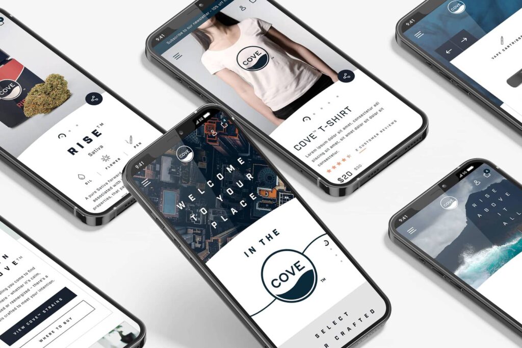
Apple Services Partner Marketing
Apple Services Partner Marketing
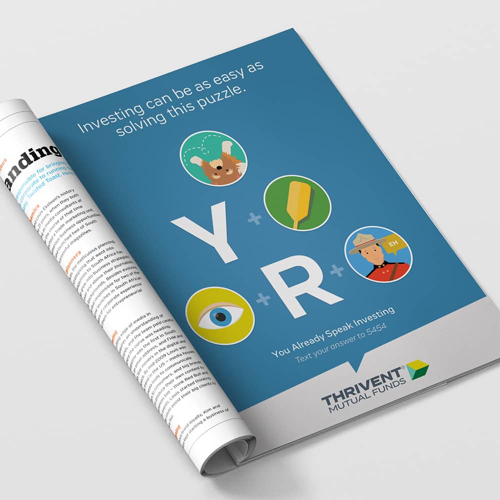
Thrivent Mutual Funds Campaigns
Thrivent Mutual Funds Campaigns
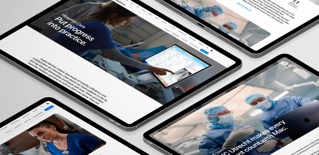
Apple Health Platform Modernization
Apple Health Platform Modernization
Apple Services Partner Marketing
Apple Services Partner Marketing

Life Storage Website Redesign
Life Storage Website Redesign
Explore More Work

McDonald’s Intranet Design
McDonald’s Intranet Design
Apple Services Partner Marketing
Apple Services Partner Marketing
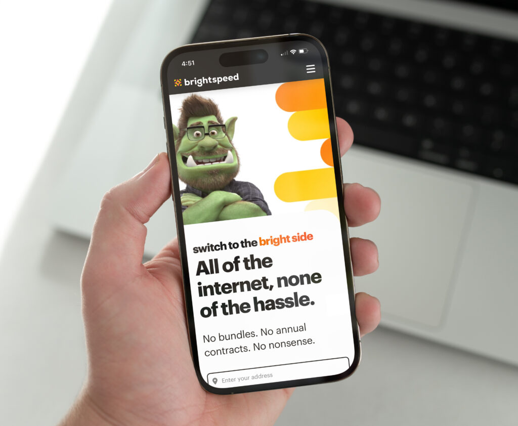
Brightspeed Product Design