Translating the Brightspeed Brand into a More Modern Digital Experience.
2025
Client
Brightspeed
The Challenge
Brightspeed needed more than a marketing site. The brand needed a digital experience that could introduce a more modern point of view while making shopping, support, and product education feel simple, connected, and clear.
This work translated the brand into a cohesive web system that feels more premium, more flexible, and more relevant to the communities Brightspeed serves.
Designing for Community at Scale.
The experience was designed to serve a broad audience across households, neighborhoods, and customer needs. From product discovery to plan comparison to service education, each touchpoint was built to feel clearer, faster, and more human. The goal was not just to modernize the interface, but to make the brand feel more present and useful in everyday life.


Insights Shaped the Experience.
Strategy and structure worked hand in hand throughout the project. By identifying customer questions, content priorities, and business goals early, the team created a stronger foundation for the experience. That thinking helped define page hierarchy, content patterns, and user flows that could support both brand storytelling and practical decision making.


Modern, Flexible Design.
The visual system balanced warmth, clarity, and utility. Interfaces were designed to feel approachable without losing precision, giving Brightspeed a more confident digital presence across product, support, and account experiences. A modular design approach also made the system easier to extend as new needs, campaigns, and pages emerged.
21%
Increased brand awareness.
55%
Increased purchase flow completion.

Clearer Paths to Browse and Compare.
Simplified navigation and stronger content hierarchy helped customers move through products and plans with more confidence.
More Consistent Customer Journeys.
Shared patterns across shopping, support, and account touchpoints created a more seamless experience from start to finish.
Built to Scale Across the Platform.
Reusable modules and flexible layouts gave the team a system that could grow with the business over time and reflect real change.

Friction-free Implementation.
Behind the scenes, the system was designed for real world rollout, not just presentation. Reusable components, scalable layouts, and repeatable content patterns made implementation easier across teams and touchpoints. That foundation helped the experience stay consistent while giving the business room to evolve.

Exo Bold
Aa
A B C D E F G H I J K L M N O P Q R S T U V W X Y Z
a b c d e f g h i j k l m n o p q r s t u v w x y z
Exo Regular
Aa
A B C D E F G H I J K L M N O P Q R S T U V W X Y Z
a b c d e f g h i j k l m n o p q r s t u v w x y z
Philosopher Regular
Aa
A B C D E F G H I J K L M N O P Q R S T U V W X Y Z
a b c d e f g h i j k l m n o p q r s t u v w x y z
A Bright, Brand Led Color System.
Color played an important role in making the experience feel more ownable and energetic. The palette helped Brightspeed stand apart visually while also supporting hierarchy, calls to action, and usability across the site. The result is a system that feels distinctive in brand moments and dependable in functional ones.
Brightspeed Yellow
#f7CC47
Attention Orange
#E07331
Base
#222222


The Outcome
A Cohesive Digital Experience That Repositioned Brightspeed for a More Modern Digital Future.
Brand elevation
41 Million
Site Visits and Counting.
Scalable foundation
25%
Contribution to Total Online Sales.
Responsive experience
77%
Increased Checkout Rate.
Explore More Work
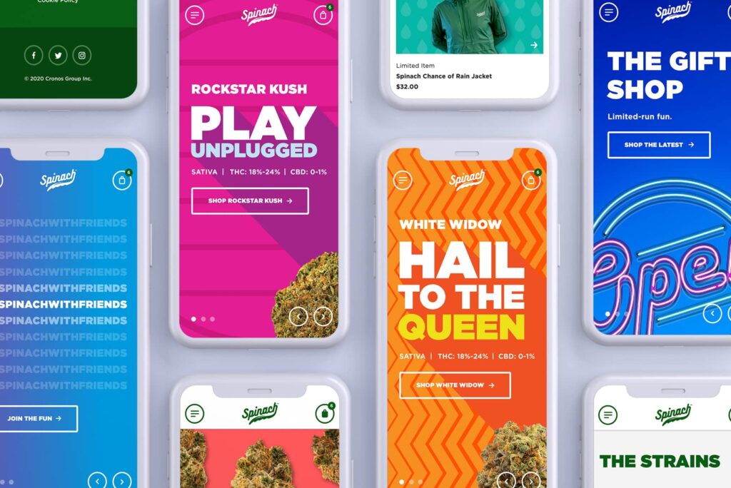
Spinach Cannabis Website Design
Spinach Cannabis Website Design

McDonald’s Intranet Design
McDonald’s Intranet Design
Apple Education Success Stories