
Modernizing a Complex Direct to Consumer HVAC Buying Experience.
A fully reimagined platform designed to simplify product discovery, guide decision making, and bring clarity to a category defined by complexity.
2024
Client
Alpine Home Air

The Challenge
Buying HVAC systems online is not intuitive. The products are technical, the stakes are high, and most customers do not know exactly what they need.
Alpine Home Air had built a strong business around this challenge, but the experience had not kept pace with how people expect to browse, learn, and purchase today. The opportunity was to rethink the entire journey. Not just visually, but structurally. From how products are discovered to how decisions are made.

I Led the Design of the Experience End to End, From UX Through UI, Across Desktop and Mobile.
This included defining the overall product architecture, designing a scalable component system, and shaping the visual language of the platform. The goal was not only to improve the interface, but to create a system that could support the complexity of the category while remaining clear, usable, and consistent.
Designing Within Real World Constraints.
The experience needed to balance technical accuracy with usability. Customers are often unfamiliar with HVAC systems, yet need to make informed decisions quickly.
The platform had to support a wide range of products, configurations, and edge cases, while still feeling approachable and easy to navigate. Every design decision was grounded in simplifying complexity without removing the depth required to make the right choice.

Designing for Early Stage E-Commerce Adoption.
At the time, purchasing HVAC systems online was not yet a common behavior.
The experience needed to build trust, reduce hesitation, and guide users through unfamiliar territory. Clear product information, structured comparisons, and supportive decision tools helped bridge the gap between browsing and buying, making the experience feel credible, reliable, and easy to act on.


A flexible design system  was developed to support the scale
  and complexity
  of the platform.
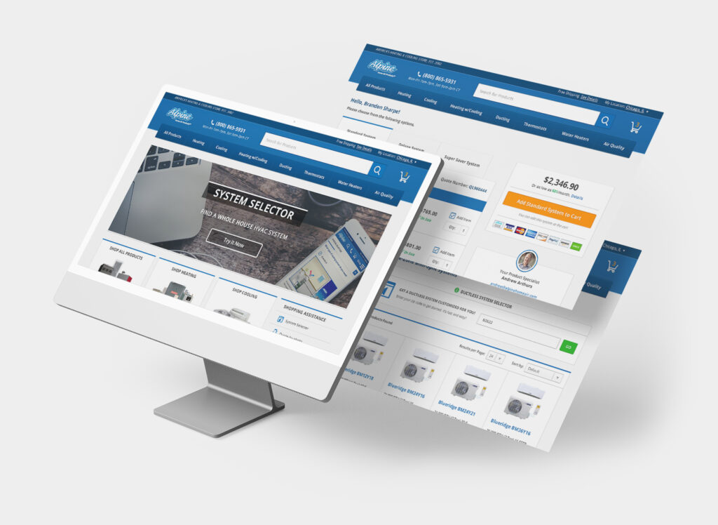

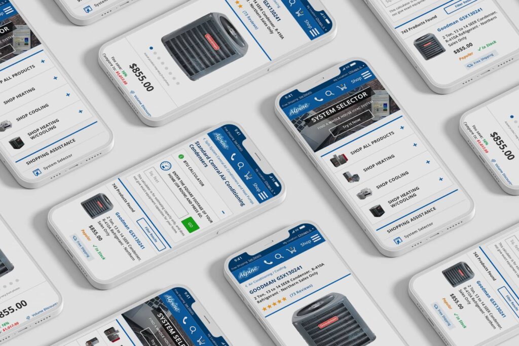
Components were designed to adapt across product types, layouts, and use cases, allowing the experience to remain consistent while accommodating variation. This system enabled faster iteration, cleaner implementation, and a more cohesive experience across the entire site.
Guiding the Customer Through Complexity.
The experience is structured to guide users step by step, from initial exploration to confident decision making.
Tools and content work together to help users understand what they need, why it matters, and how to choose the right solution. Instead of overwhelming users with information, the platform surfaces the right details at the right time, creating a more intuitive and supportive journey.

Clarity Through Design and Guidance.
Education is integrated directly into the experience, with supporting tools and guided flows that help users evaluate options, understand system requirements, and make informed decisions without needing external research.
The visual language is clean, structured, and purposeful. Layouts prioritize clarity and hierarchy, while interactions remain simple and predictable. Across desktop and mobile, the experience maintains consistency while adapting to different contexts, transforming the platform from a simple storefront into a trusted, intuitive resource.

The Outcome
A Cohesive Digital Foundation Built for Clarity and Scale.
The result is a platform that transforms a complex purchasing process into a clear and manageable experience. By aligning product discovery, education, and decision making into a single system, the site enables customers to move forward with confidence. What was once technical and difficult becomes structured, understandable, and actionable.
Decision making
Clarity.
Making complex decisions easier.
Scalability
Systems.
Structured to grow with product complexity.
Usability
Platforms.
Designed to organize, not reduce.
Explore More Work
Brightspeed Product Design
Brightspeed Product Design
COVE Cannabis Website Design
COVE Cannabis Website Design
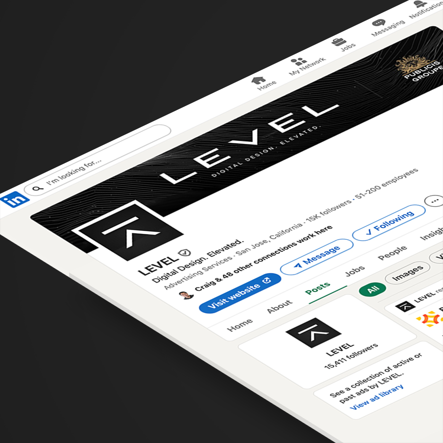
Level Studios Agency Branding
Level Studios Agency Branding
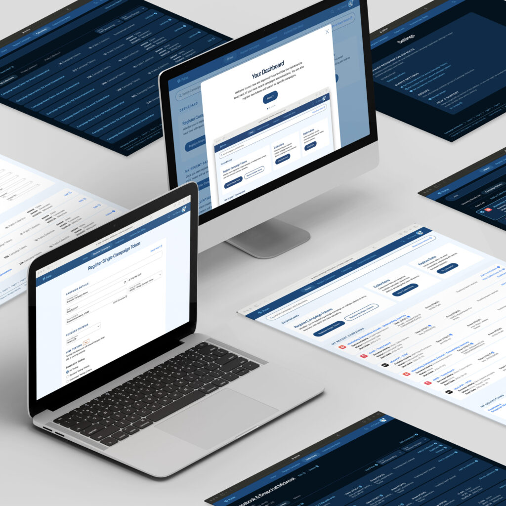
Pulse Data Analytics Tool
Pulse Data Analytics Tool
COVE Cannabis Website Design